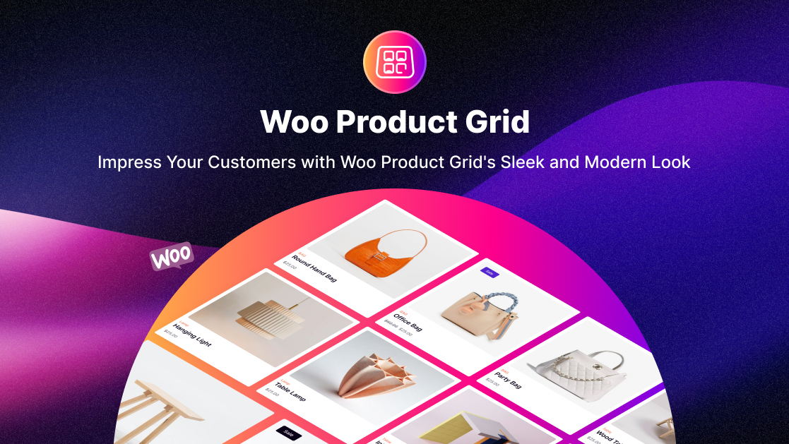
Impress Customers with Woo Product Grid's Modern Look
Did you find yourself wondering “Why should I choose the Woo Product Grid?” as soon as you opened this blog?
Woo Product Grid module provides you with an efficient and customizable way to present your WooCommerce products on any page. With a wide range of styling options available, you can customize the look and feel of your product grid to your brand and design preferences.
Woo product gird module saves a lot of time in designing a Product Launch page, it helps you to design quickly. By displaying your products in an organized and visually-appealing manner, you can effectively showcase your products, and generate more sales.
To help you get started, we have provided step-by-step instructions on how to configure and style your Woo Product Grid. These guidelines will guide you through the process, helping you create a personalized and professional-looking product grid that perfectly suits your business needs.
Content Tab
How to Activate the Woo Product Grid Module: A Step-by-Step Guide
Feeling overwhelmed with activating Woo Product Module Grid? No worries. Here’s some simple steps to guide you-
- Ensure that you have the ‘WooCommerce‘ Plugin activated on your WordPress website. This is a prerequisite for using the Woo Essential – shop builder, which includes the Woo Product Grid module.
To begin,
- Navigate to the visual builder and first take a row in a section. After that, search for the ‘Woo Product Grid’ module using the search feature.
- Once you find the module, simply click on it, and it will smoothly appear on the page through the Divi page builder.
This process is designed to be user-friendly and easy to follow. By providing these clear and concise instructions, we aim to help you get started with the Woo Product Grid module quickly and efficiently.
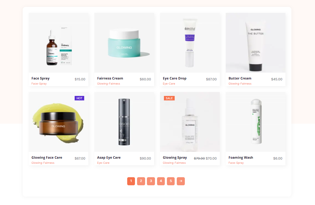
Once you’ve completed step successfully, here’s what the module will look like for you
Content Tab → How to Configure the Content Settings:
If you navigate to the ‘Content’ tab, you will see various options to help you customize your product layout. These options include ‘Select Layout’, ‘Product View Type’, ‘Hide Out of Stock Products’, ‘Thumbnail Size’, ‘Product Count’, ‘Offset Number’, ‘Sorted By’, and ‘Order By’.
According to your preferable layouts, you will get separate attractive layout designs.
Selecting a preferred layout style will improve the appearance of your product page and make it more visually appealing to customers.
1. The ‘Product View Type’ option allows you to sort products by categories such as ‘Best Selling,’ ‘Sale,’ or ‘Top Rated,’ allowing you to highlight popular items and motivate customers to purchase them.
2. The ‘Hide Out of Stock Products’ option prevents customers from seeing products that are not currently available, avoiding potential frustration or confusion.
3. Adjusting the ‘Thumbnail Size’ can help showcase your products more effectively, allowing customers to view them more clearly and in more detail.
4. Using the ‘Sorted By’ and ‘Order By’ options can assist you to organize your products in a way that makes the most sense for your customers, making it easier for them to find what they are looking for.
Content Tab → How to configure the Display Settings:
Style the below important icons by enabling each icon:
1. Add to cart/ Select Options Icon
- WishList Icon
- Add Compare Icon
- Quick View Icon
Moreover, you can conveniently enable various options under the ‘Display’ tab, including the ‘Add to Cart’ button, ‘Quick View’ button, ‘Show Price’, ‘Show Category’, ‘Show Star Rating’, ‘Show Product Count Top Bar’, and ‘Featured Product Badge’. These options allow you to customize the appearance of your product page further and enhance the user experience for your customers.
We are pleased to announce that you can now easily customize certain texts of your product page, including the ‘Add to Cart’ text, ‘Select Options’ text, ‘Quick View’ text, ‘Featured Product Badge’ text, and ‘Sale Badge Type’ text.
These features allow you to personalize your product page and reshape it to better match your branding and messaging.
If you want to display a badge indicating a sale on your product page, you can choose from three options: ‘Sale’, ‘Percentage’, or ‘None’. Additionally, you can enable the ‘Pagination Type’ option, which offers three choices for how to display your products: ‘None’, ‘Numbers’, or ‘Load More’.
These options provide flexibility in customizing the appearance of your product page and improving the browsing experience for your customers.
Content Tab → Pagination
In WooCommerce, ‘Pagination Type’ refers to the way that your products are displayed on your shop or product archive pages.
There are three pagination types to choose from:
None – This option displays all of your products on a single page without any pagination. This is suitable for shops with a small number of products.
Numbers – This option adds page numbers to the bottom of your shop or product archive pages, allowing your customers to navigate through your products more easily.
Load More – This option replaces the page numbers with a ‘Load More’ button that your customers can click to reveal more products. This option can help to reduce the amount of scrolling that your customers need to do to find the products they’re interested in.
Overall, the Pagination Type option in WooCommerce provides a way to control the display of your products on your site and allows you to choose the method that works best for your shop and customers.
Content Tab → Product Settings:
To personalize your product filtering, simply use the drop-down menu.
From there, you can easily choose between the options of Default, Latest Products, Feature Products, Sale Products, Best Selling Products, Top Rated Products, and Product Category from the product view type.
You also have the ability to use the ‘Order By’ feature to sort products by date, modified date, title, slug, id, and random order. Additionally, you can choose between ascending or descending order with the ‘Sorted by’ option. Other options include ‘Product Counts’ and ‘Offset’ to organize how your products are viewed.
Lastly, you can customize the size of the product thumbnails and choose from options such as Full, WooCommerce Thumbnail, and WooCommerce Single for a more customized viewing experience for your customers.
Design Tab
Design Tab → How to Style Woo Product Grid
Switch to the ‘Design’ tab to style all the features of Woo Product Grid. Just simply from the image settings – style images through the image height, image rounded corners, border styles, etc.
You can customize the module and the products using the Product Price, Add to Cart, View Cart, Quick View, Quick View Pop Up Box, Quick Box popup arrow, Wishlist, Compare, Sale badge, Out of Stock badge, Featured badge, pagination, top bar, rating, sizing, and spacing – as needed.
To style each Woo Product Grid feature, switch to the “Design” page. Simply style images by adjusting their height, rounded edges, border styles, etc. in the image settings.
Design Tab → Product Price Design
To set up the product price, you will need to navigate to the design tab and select the product price section. Here you will be able to set the font, font weight, height, width, text color, and text size of the product price. Additionally, you can also set the regular price and the new price of the product.
Design Tab → Design Add to Cart, Wish List, Compare, Quick View
To customize the Add to Cart button or icon in the design tab of the Woo Product Grid module of the Woo Essential plugin, you’ll need to navigate to the design tab and select the Add to Cart section. Here you can configure the background color, font, font weight, height, width, text color, text size, border color, and border width of the button or icon.
Design Tab → Sale Badge, Out of Stock Badge, Featured Badge
To set up the design tab, you’ll need to navigate to the design tab and select the required section. Here you can configure the background color, font, font weight, height, width, text color, text size, border color, and border width of the button or icon.
Design Tab → QuickView PopUp
Select the Quick View option and make sure it is enabled. Then, you can customize the Quick view Pop-up by adding the title, price, button, and meta options. To do this, simply click on the “Design” tab and select the options you want to add. You can also customize the styling of the pop-up by selecting the color, font size, and other styling options.
Once you are done, save your changes, and the Quick View pop-up and other settings will be ready to be used on your site.
Final Scenario
Overall, The Step By Step Woocommerce Products Grid Module is a valuable asset for anyone running an online business utilizing the WordPress & Woocommerce platforms, as it provides easy navigation and visual appeal through customizable designs. It not only helps to boost customer happiness, but it may also lead to greater sales because people do not spend much time browsing websites before making purchases.

